A lot of the consumer behavior effects I have demonstrated thus far in my #1QFriday series have been on the question side of things. For example, “How many miles…” versus “How few miles” is a markedness effect built into the actual question. This week’s survey looks at the answer side of things:
What do you think is the average attendance at a (FBS) college football game?
Everyone saw the SAME EXACT QUESTION. There were no differences with the actual question. There were, however, differences with the format/structure of the answer slider. Two things were different:
- Starting point: people either started at 0 or 100,000
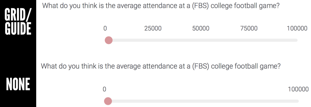
- Grid/guide: people either saw a grid (with references at 25,000, 50,000 and 75,000) or they did not.

In other words, there were four possible answer conditions:
- Start at 0 with a grid (see above top)
- Start at 0 without a grid (see above bottom)
- Start at 100,000 with a grid
- Start at 100,000 without a grid
So why did I want to try this out? The starting point (0 versus 100,000) would likely result in an anchoring effect. I have talked about this in past posts, but anchoring essentially occurs when a person sees a number and uses it as a basis for judgment. In this particular scenario, one group was starting at 0 and dragging the slider to the right to determine attendance. The other group was starting at 100,000 and dragging the slider to the left to make an attendance estimate. Think that makes a difference?
The second part focused on whether there was a grid or not (see photo). The idea was that a grid would influence people as it would guide them toward a particular number (ex. 50,000) similar to an anchor. Or, potentially it would be tougher to keep passing the guide markers as it may take additional mental effort. In other words, if I start at 0 and drag the slider past 25,000 and 50,000, I might start second guessing whether I am estimating too large of a number. So let’s see what happened…
DISCUSSION

What do you notice?
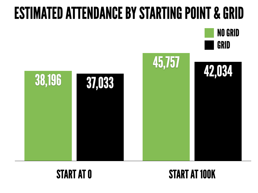
Starting point. There is a pretty large difference in estimates between the people who started at 0 and the people who started at 100,000. Should where you start on a slider influence how many people you think go to a college football game!? NO. That is crazy! But it does.
Grid. There was not as big of a difference in the no grid vs. grid conditions as I anticipated. Still, it appears like it may have some effect. The people who had a slider with a grid/guide on it tended to answer lower.
What might play a role?
Anchoring. The people who started at 0 estimated lower attendance than the people who started at 100,000. Why? Because they were anchored at two very different estimates (o people vs. 100,000 people). In theory, this should make no difference but it does. Anchoring is one of the most powerful effects in psychology.
Knowledge. Let’s assume the majority of the people who answered are somewhat knowledgeable about college football. They probably aren’t going to guess that the AVERAGE attendance is 10,000 or 90,000. They know better. Thus, knowledge likely helped reduce the anchoring effect. What if I polled people who had zero interest in or knowledge of college football? The anchoring effect, and potentially the effect of the grid/guide, might have been even stronger.
So what is the takeaway?
In this particular case, the difference between starting at 100,000 with no grid and starting at 0 with a grid was over 8,000. That is, the answer format, influenced estimates of attendance by over 8,000 people. It would be interesting to look at combinations of question changes (ex. many vs. few) and answer format (ex. starting at 0 versus 100,000). That being said, as shown in this particular study, answer format matters. Even something that seems small such as starting them at a different point on a slider or including a grid.
The other question this brings up is what answer do you trust/use? Assuming this was some sort of market research study, do you only take the answers where the slider started at 0? According to CBS Sports, the average attendance at FBS games last year was 43,483. So if we’re rating responses by how close they were to the actual answer, starting people at 100,000 actually helped. As marketers, we try to develop good survey questions (ex. unbiased, don’t ask about too many things in one question, etc.) but the last two #1QFriday posts have shown how one word, the order of the words, or the answer format may DRASTICALLY influence responses.
_______
#1QFriday is a blog series that includes my random consumer behavior thoughts and musings. I do not claim to be the first person to think of these things or deny that others have done research on them. I am simply discussing interesting marketing, psychology and linguistic topics that come to mind. Furthermore, I am avoiding statistical analysis as I want the emphasis to be on the ideas. I recently read (Amazon affiliate link) Paul Grice: Philosopher and Linguist and was inspired by a less statistical and more philosophical approach. Thus, the results here could happen by chance. I want to focus on thinking about, discussing and debating the ideas at a broad level rather than whether or not the differences are statistically meaningful. I typically send out a quick survey on Friday and post an analysis/discussion the following week.
Comments
One response to “Anchoring and The Effect of Survey Answer Format”
[…] closer, to the number provided. The nature of the numbers (big/small, odd/even, etc) may have anchored responses and influenced numerical […]